

💻 Card Types
Discover the 11 diverse card types available on our platform to effectively showcase your content. Enhance your user experience with the right card selection!
Understanding Card Types
Explore the different card types available in our system and learn how each one functions. Whether you're looking for the core content cards, interactive elements or dynamic content blocks, this knowledge base provides a clear breakdown of their uses and benefits. Understanding these card types will help you design better layouts and create more engaging user experiences. Dive in and find the right card for your needs!
The tchop platform offers the following 11 card types that cover all kinds of cases, content types and needs:
Card Name | Description | Behaviour |
|---|---|---|
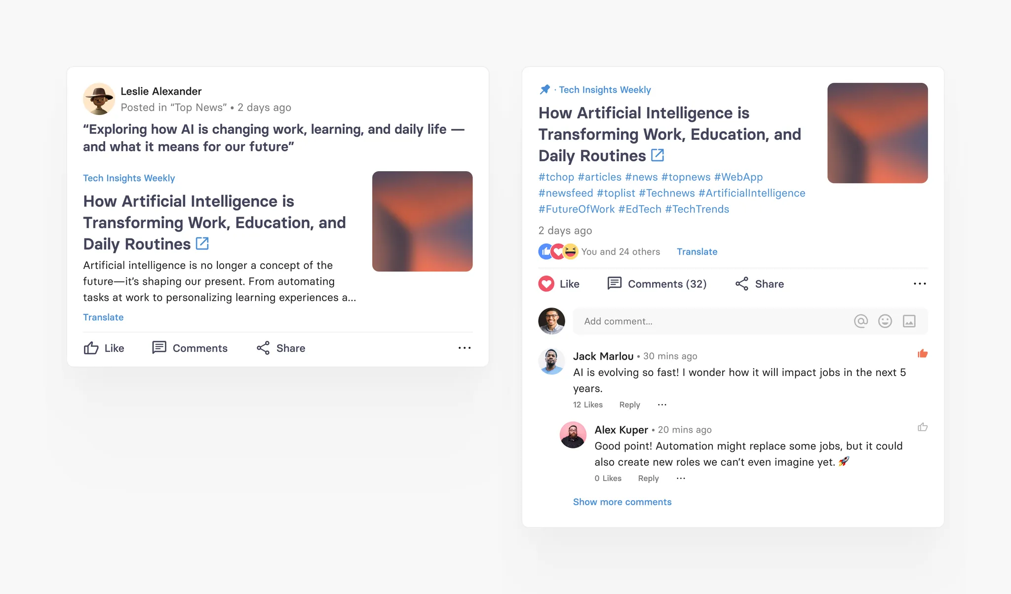
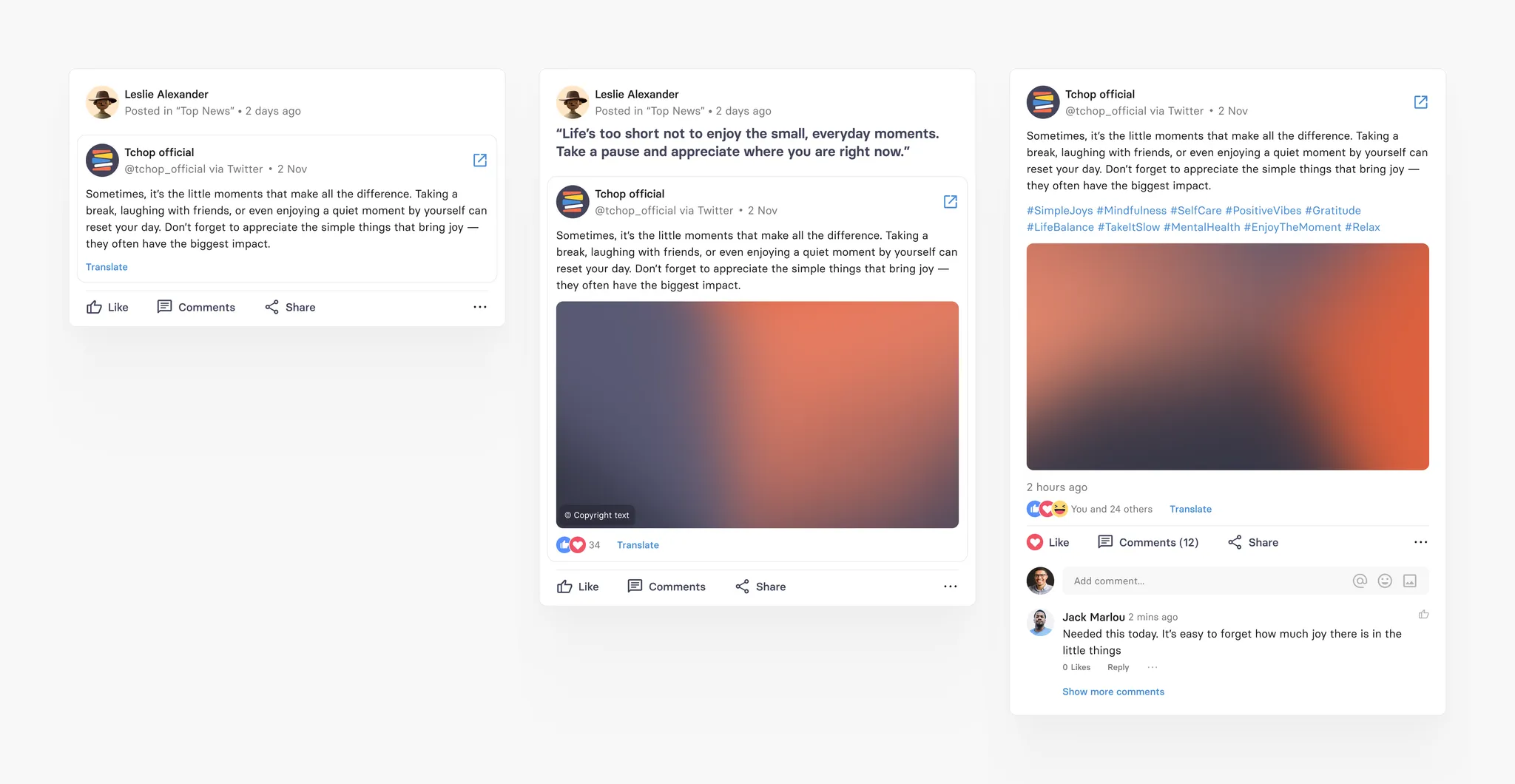
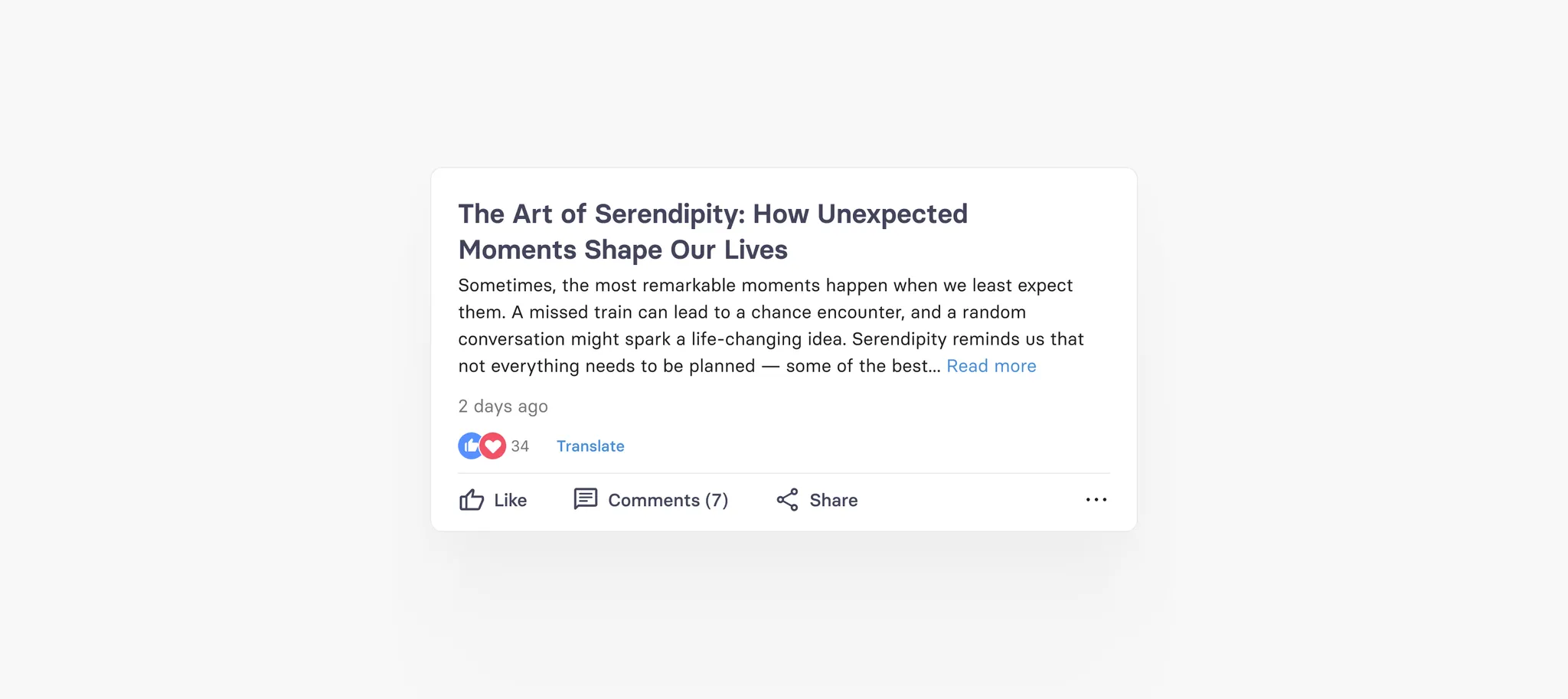
Thread | A discussion thread that can be discussed, means that holds comments, replies and likes. | Opens comments |
Article | Shows a native teaser and links to any given URL. | Opens Article in app (mobile) or other browser tab (web) |
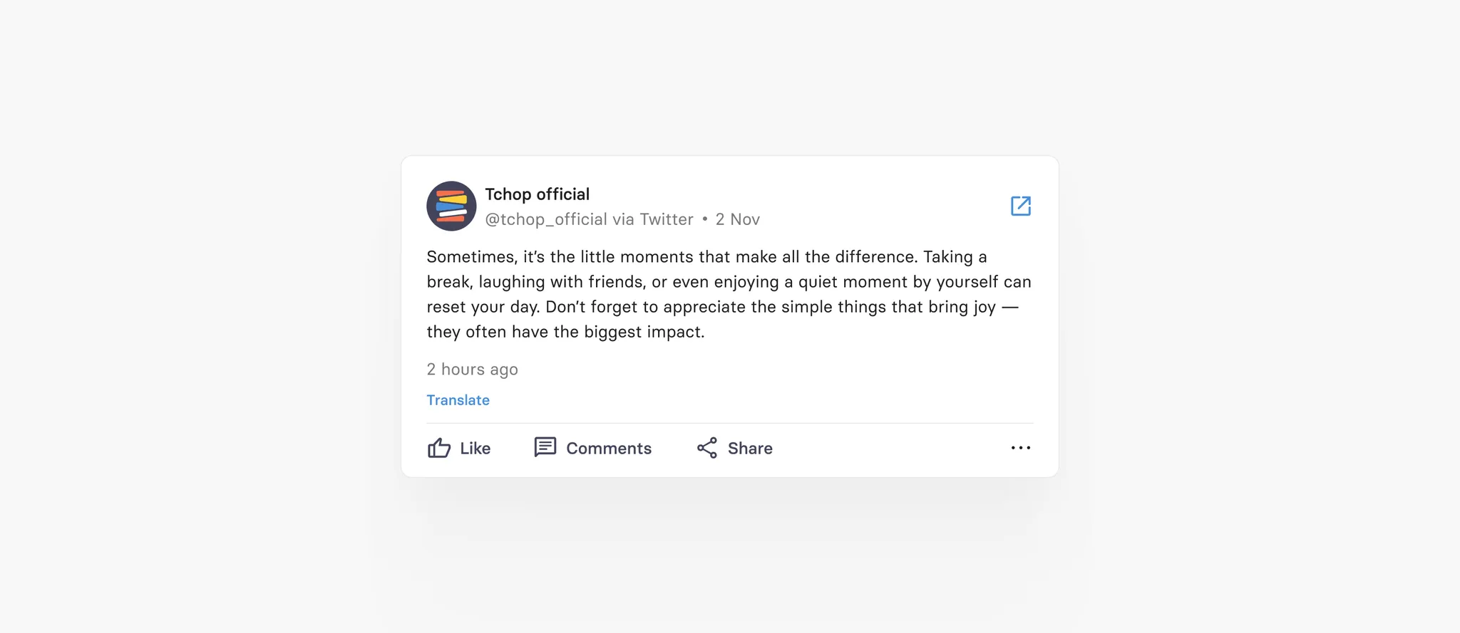
Social | Previews social media posts and links to the source | Opens social post in app (mobile) or other browser tab (web) |
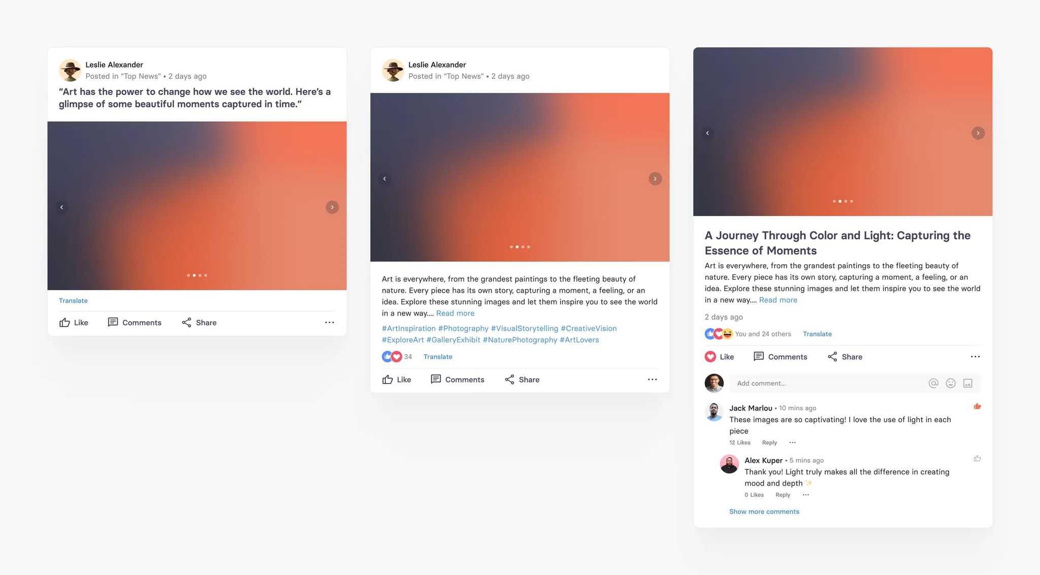
Post | A long, full native post with teaser and rich formatting inside the text (images, formatting etc) | Opens full post in separate native view |
Text | Shows a text post similar (with limited styling and formatting options in the text) | Opens text if necessary in separate native view |
Image | Shows an image plus text options (with limited styling and formatting options in the text) | Opens text if necessary in separate native view |
Gallery | Shows a gallery of multiple images, that the user can open and swipe through | Opens gallery to swipe through and text if necessary in separate native view |
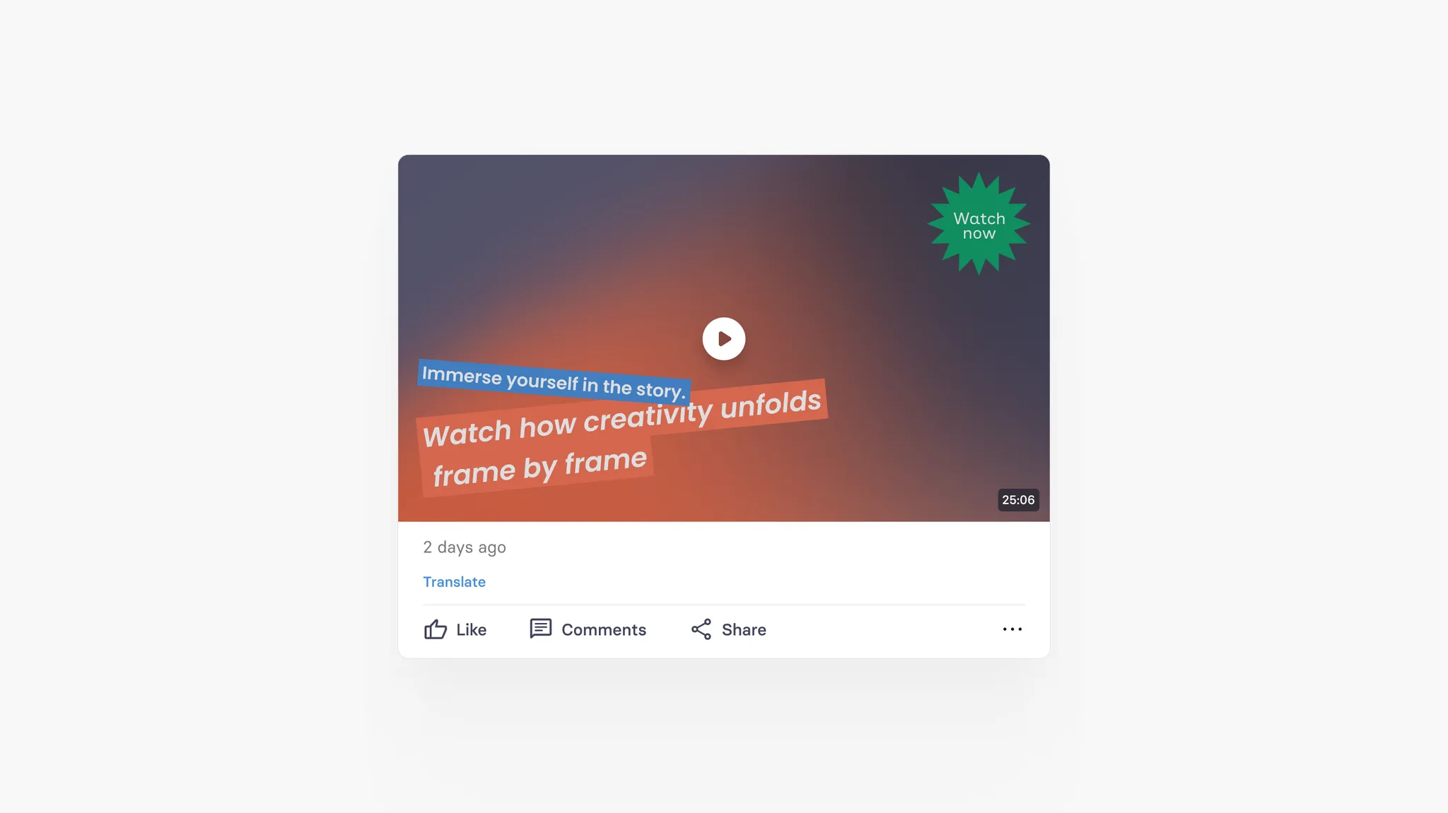
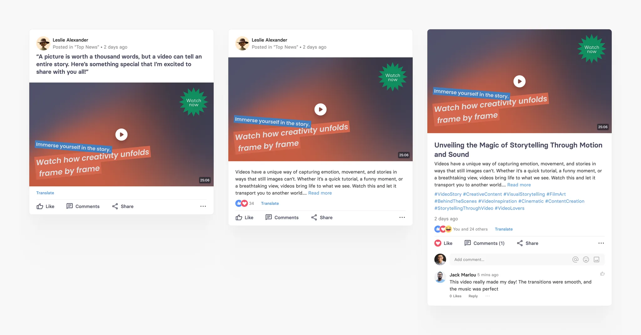
Video | A video with teaser image and text that can be played natively within the app | Plays video in teaser or in detail view |
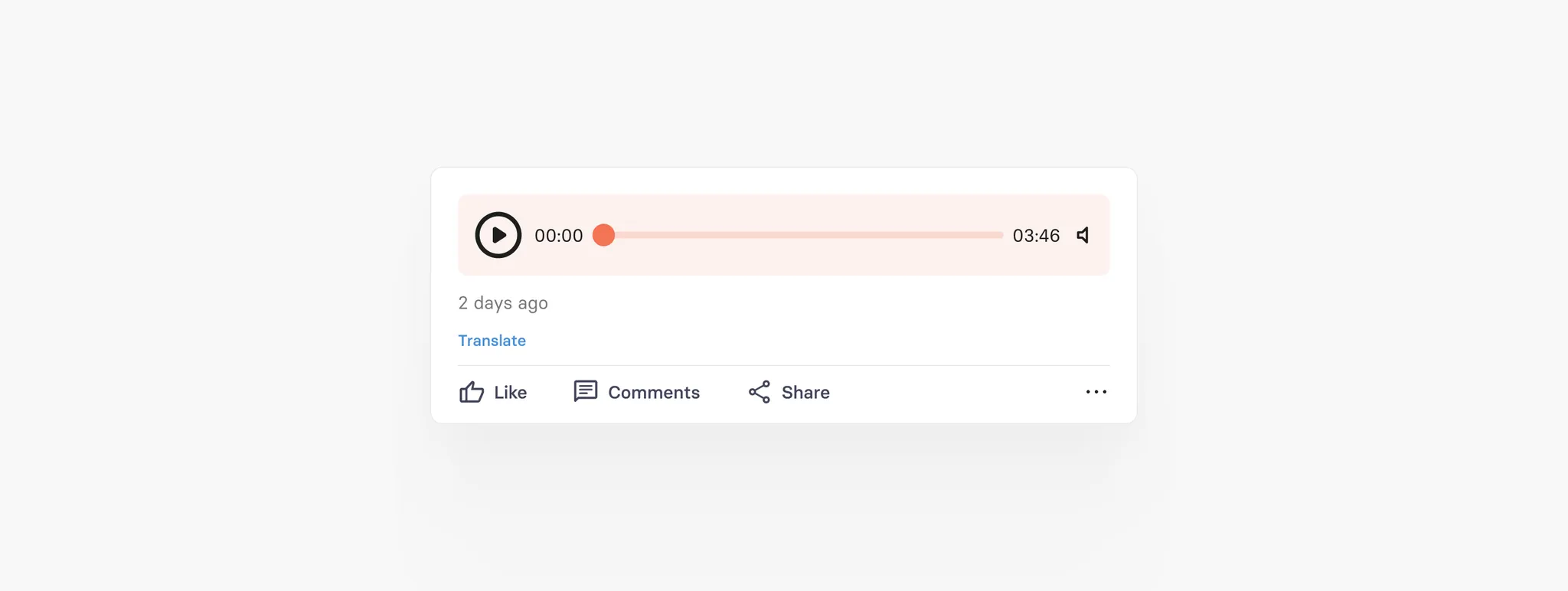
Audio | An audio file (eg podcast) with teaser image and text that can be played natively within the app | Plays audio in teaser or in detail view |
A PDF file with teaser image and text that can be played natively within the app | Opens PDF in a separate view (mobile) or tab (web) | |
Poll | An interactive poll card with single or multiple choice options to collect instant feedback from users. | Displays inline voting options; results update dynamically after voting |
Common Fields
All card types have the following fields in common:
Posted Time: This timestamp indicates when the card was initially published. If the card is reposted or pinned, the posted time gets updated accordingly.
Updated Time: Denotes the last time the card was updated or any changes were made to its content.
Created Time: Indicates the time when the card was originally created.
Author: Specifies the individual who created the card. This author can be changed, and another user can be assigned as the author to the card if needed.
Card Types
We describe all card types in detail in the following, so that it is easy to get an idea of how it looks and works.
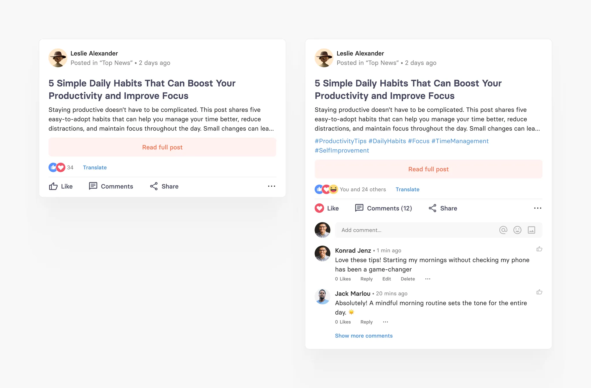
It is important to understand that all cards can have comments and reactions, optionally together with the display of the user who has posted the card. The comment, reaction and the user display are optional as they create a more social experience to selected content in the feed.
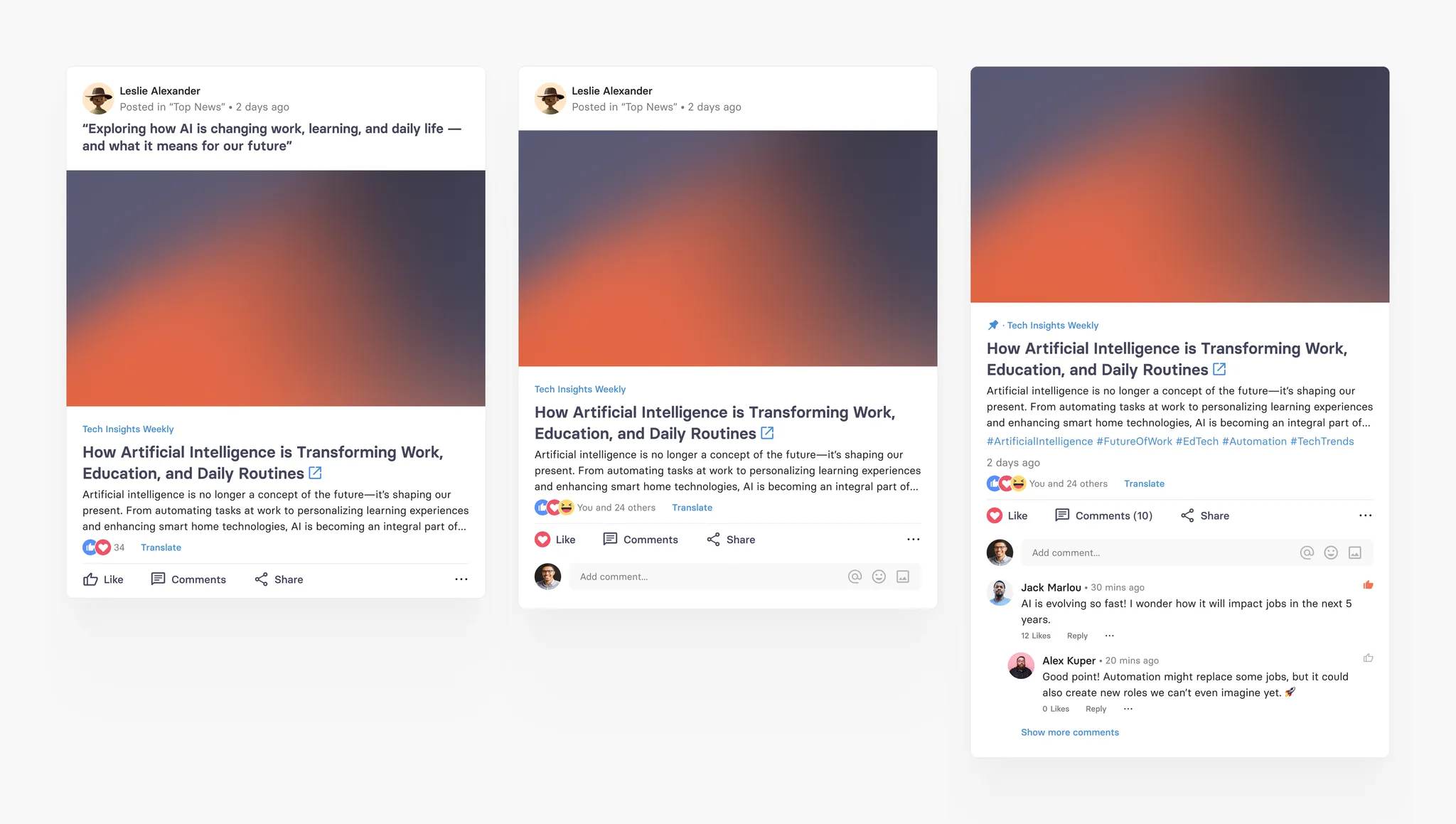
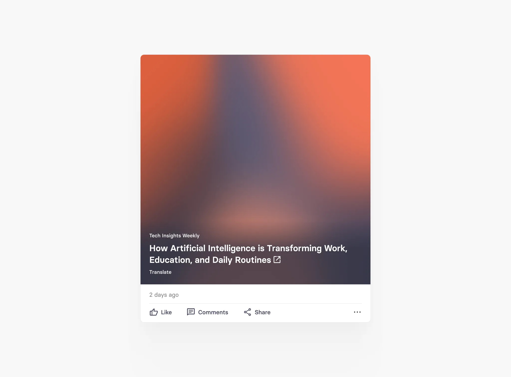
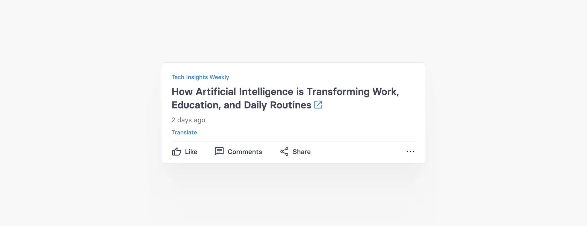
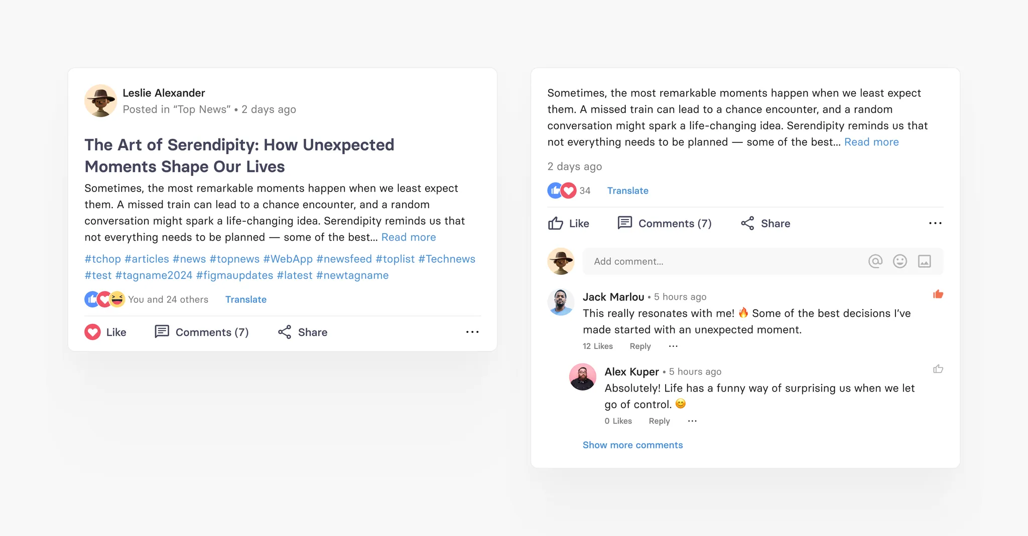
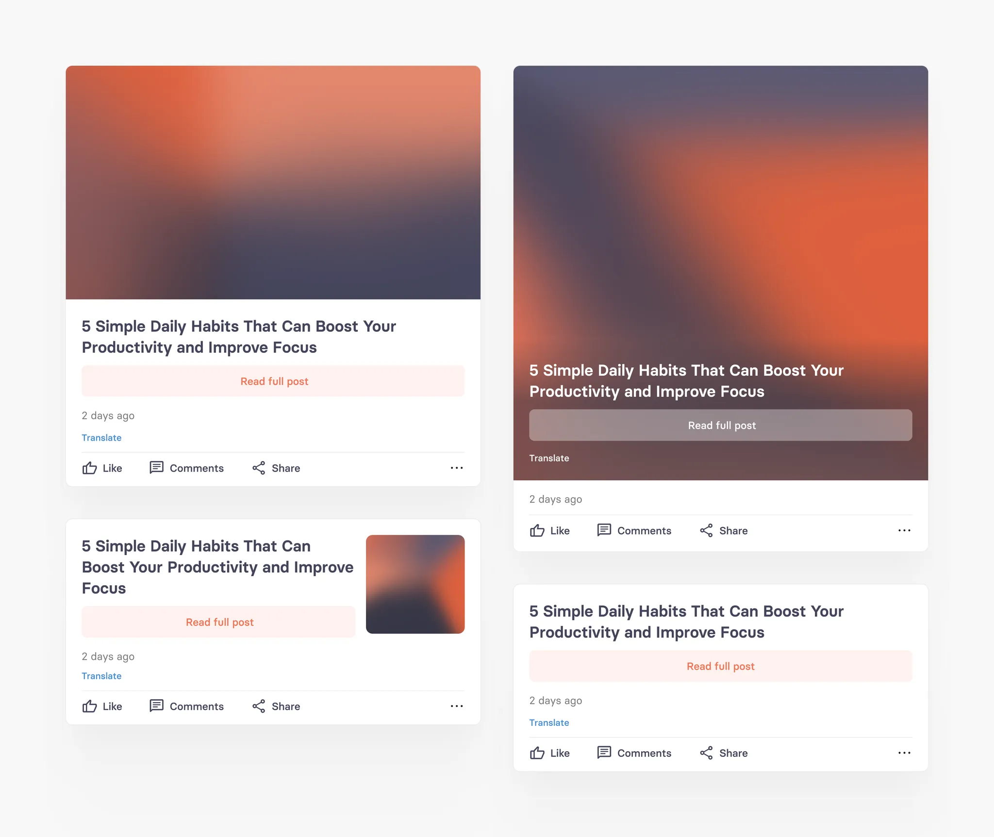
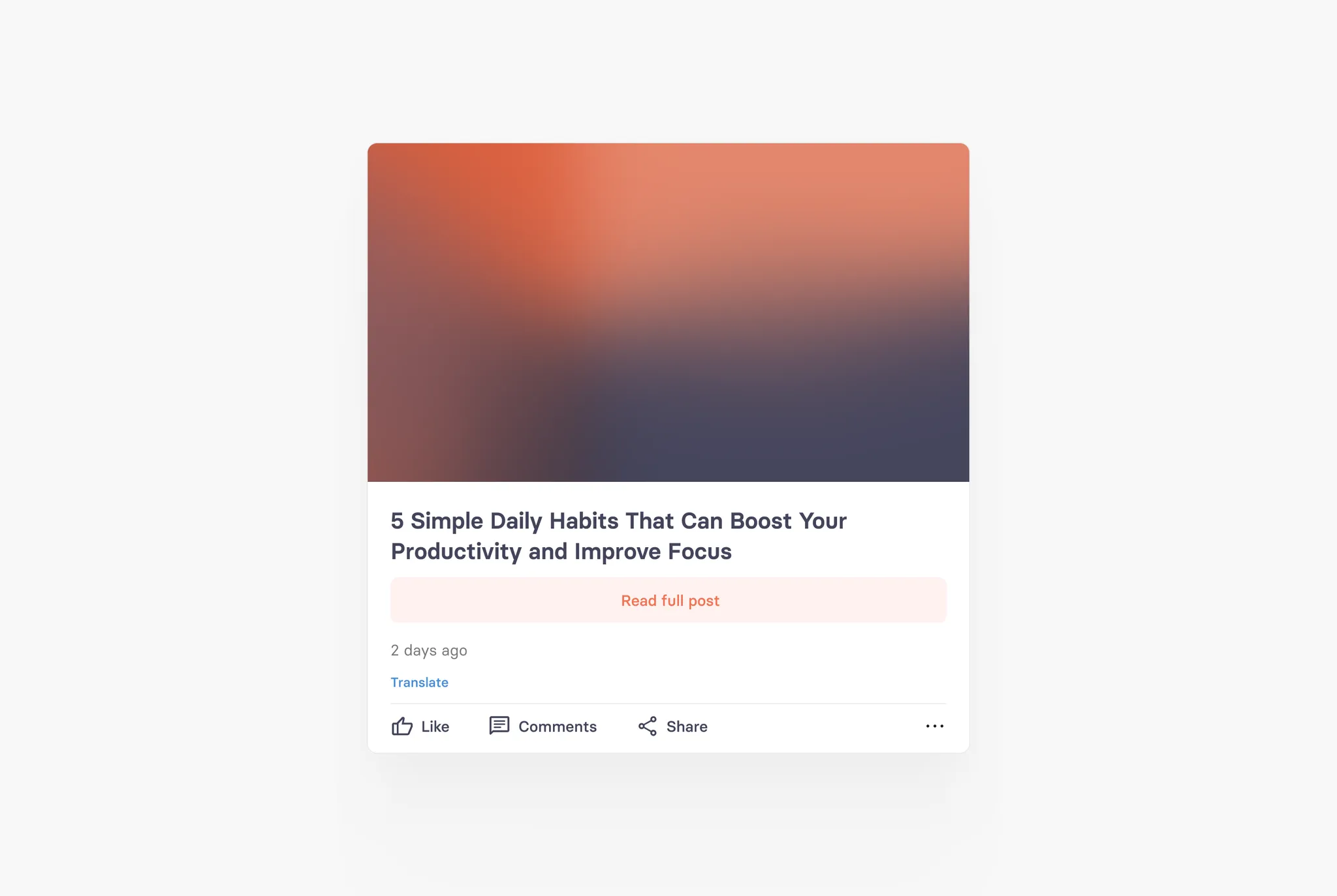
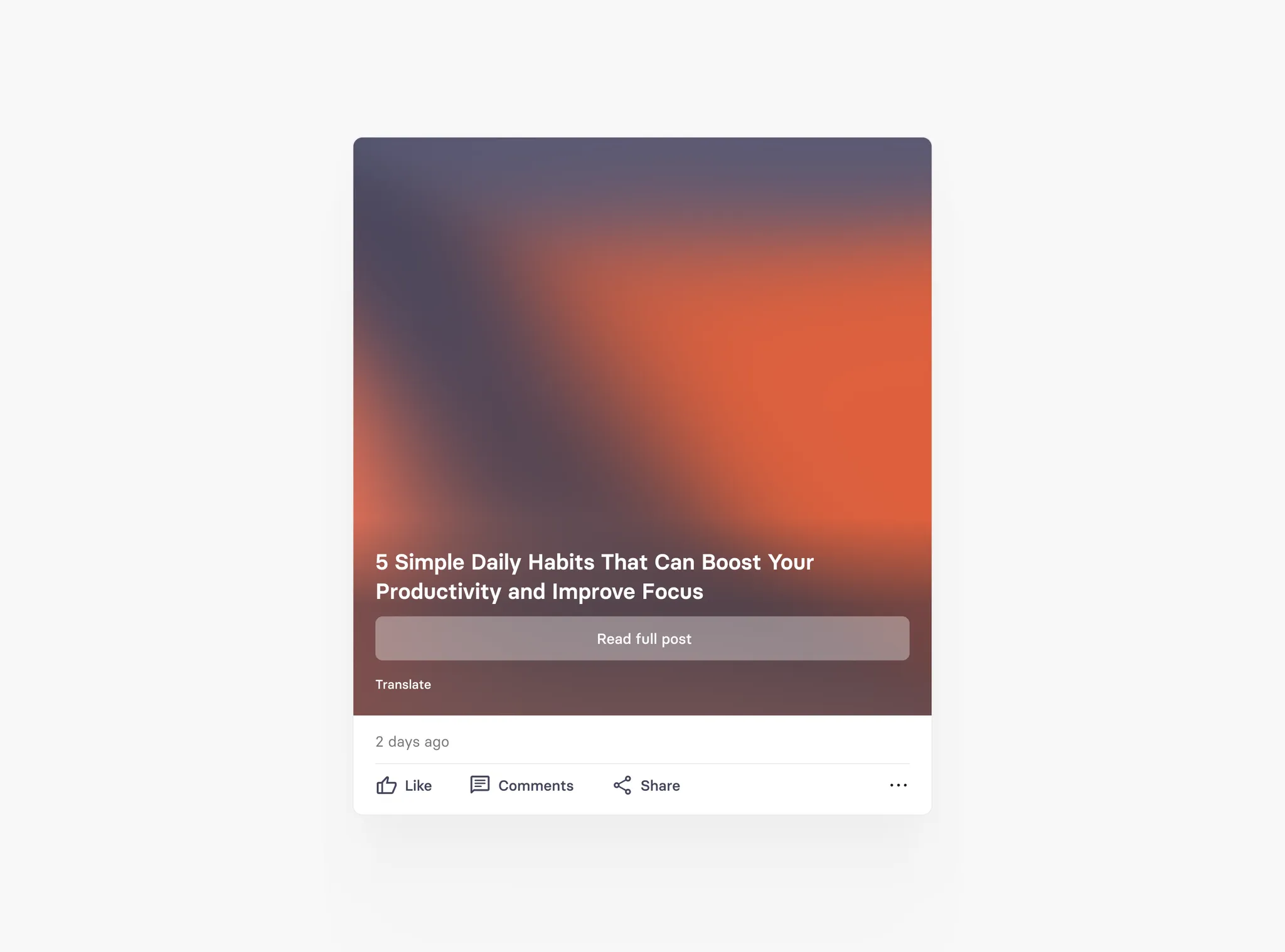
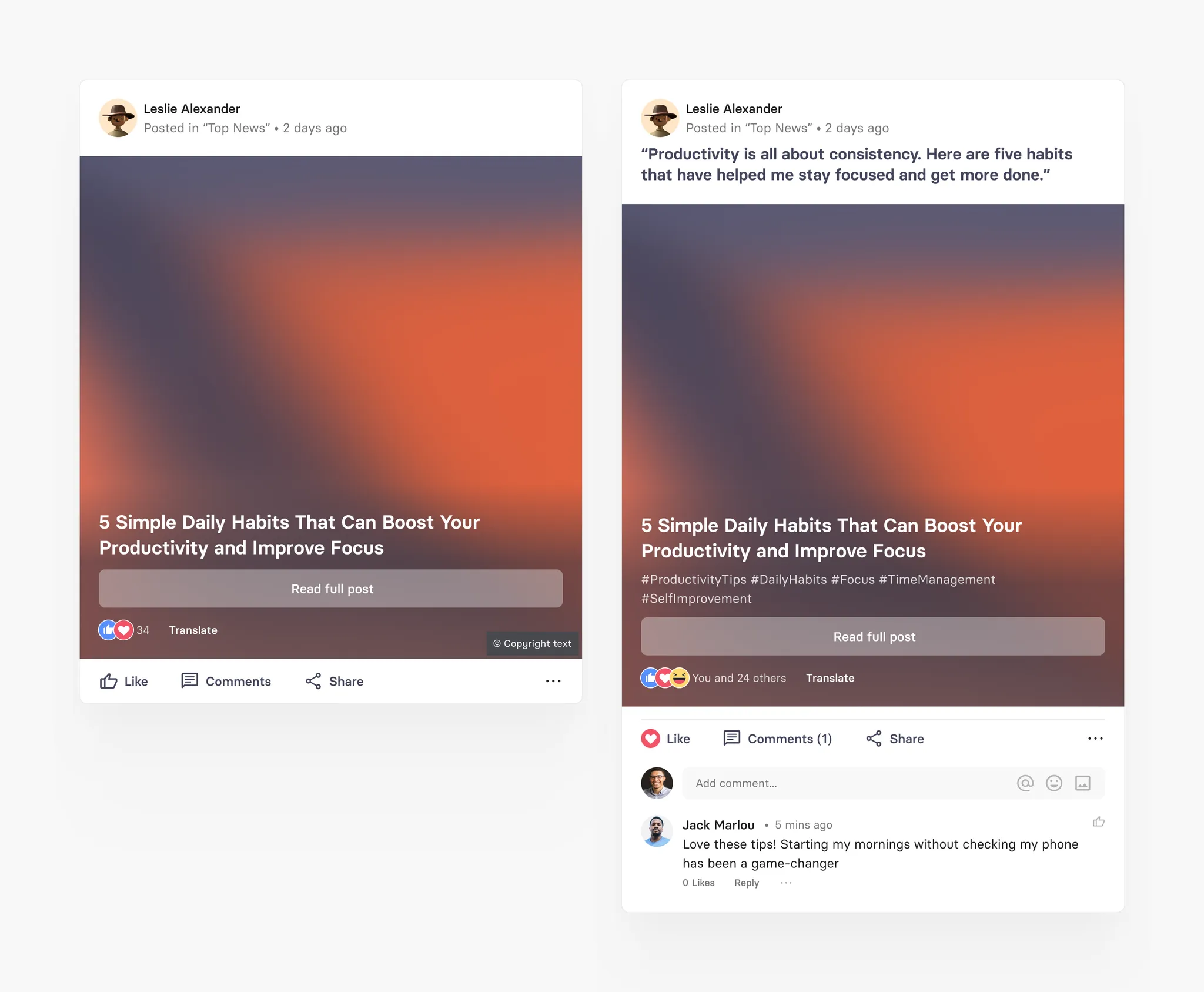
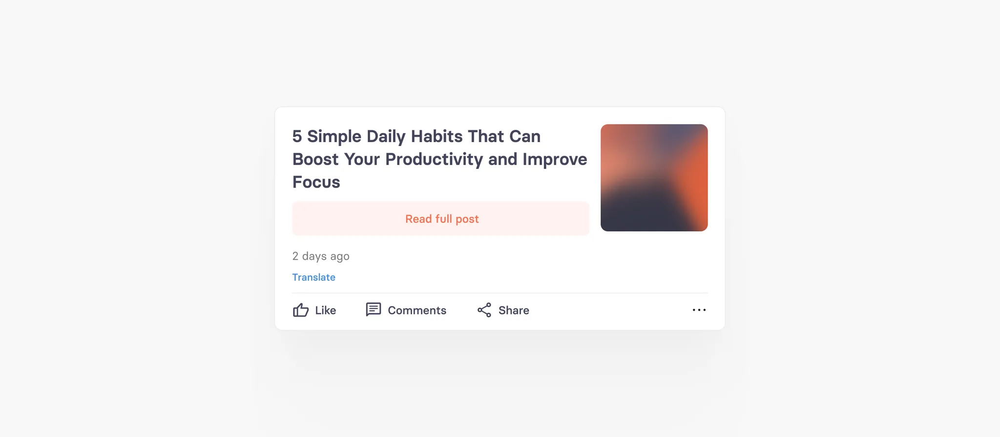
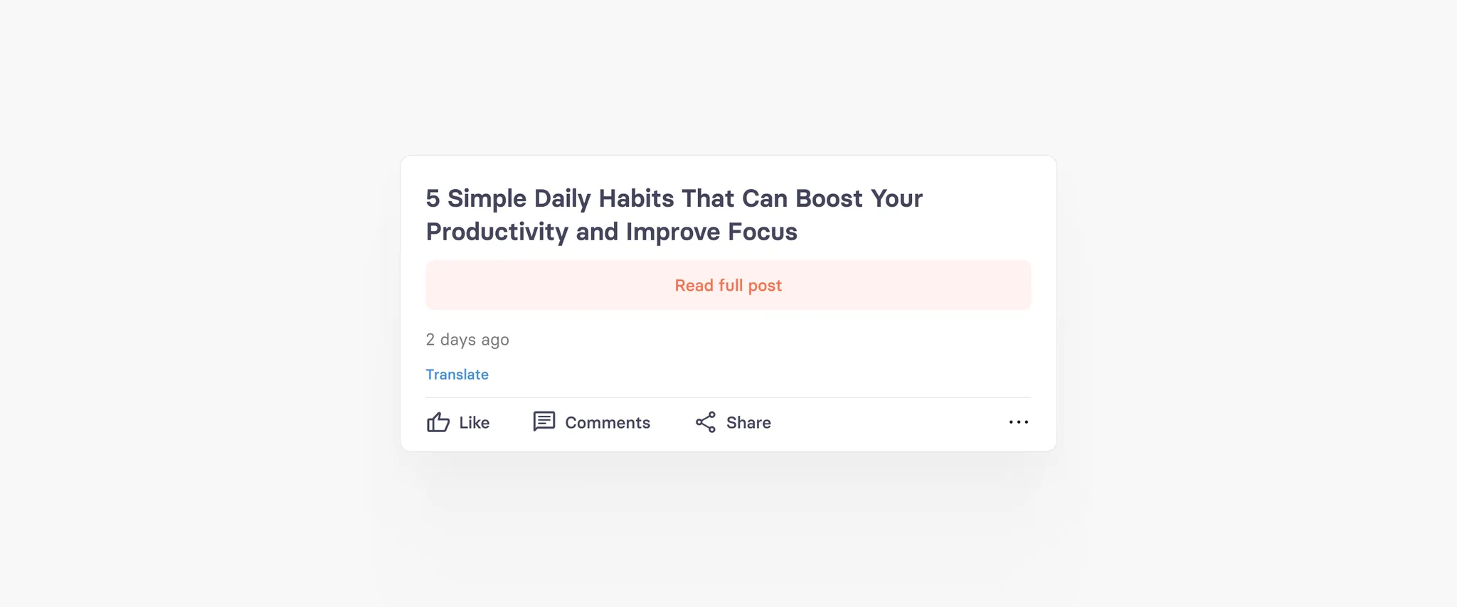
Article
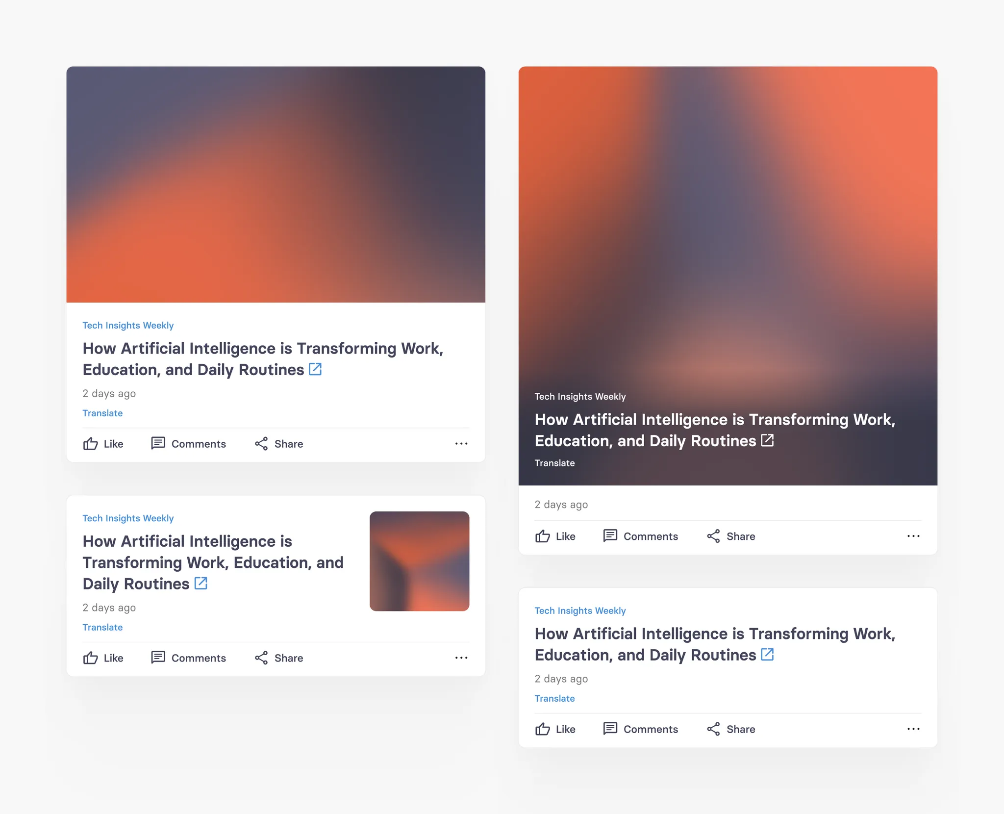
tchop is very much about content curation, anything that has a URL can be curated, added and linked easily. The article card is the base for this as it can link to any domain given. Any link opens seamlessly within the app.
The only field that this card always requires is the headline and the source. Plus: to create a stunning mix of cards, you can customise the teaser for this link with an image, multiple teaser types and text fields. Nothing looks more boring than an endless list of the same looking teasers.
Article cards with images therefore can have four different teaser types. But of course this card can also just use headline and source - without an image.
Standard Default Type

Big Image Teaser
Small Image Teaser

No Image

Article card specification
Field | Limit | Field type | App UI condition | Comment |
|---|---|---|---|---|
Comment | Max. 360 characters | Optional | Shown full text | |
Source | Max. 160 characters | Mandatory | Shown in one line with '...' | |
URL | NA | Mandatory (not editable field) | Not visible in app | Field is auto generated when you parse a URL |
Title | Max. 160 characters | Mandatory | Shown full text | |
Abstract | Max. 700 characters | Optional | Shown full text | |
Image/Gifs | Max. 700 MB | Optional | Shows full image in different variants depending on teaser style | |
Copyright text | Max. 160 characters | Optional | Shown in one line with '...' over the image | Only appears if image is added |
Copyright type | 1. Copy right unknown (default) 2. Creative Commons 3. Licensed 4. Sublicensed | Copy right unknown (default) | Not visible in app | Only appears if image is added |
Teaser style | 1. Standard (default) 2. Small w/ intro 3. Small w/o intro 4. Big w/o intro | Standard (default) | Image is shown differently based on teaser style format | Only appears if image is added |
Author field | Max. 60 characters | Optional | Shown in one line with '...' |
Social card
tchop’s content curation power of course does not stop at traditional media or news content, it also includes content from the most popular social media networks like
Facebook,
Instagram,
Twitter or
TikTok.
To display social media content we have a special card type that mirrors the most important content fields in a native view. This allows to seamlessly display social content in your app. The click on the card opens the URL of the original posts.
Social cards can have images or even image galleries included, but they can also just contain text. In any case they open the social post via the post URL provided in the app (the same way this is done for articles).
Social card specification
Field | Limit | Field type | App UI condition | Comment |
|---|---|---|---|---|
Comment | Max. 360 characters | Optional | Shown full text | |
URL | NA | Mandatory (not editable field) | Not visible in app | Field is auto generated when you parse a URL |
Author | NA | Mandatory (not editable field) | Shown in full | Field is auto generated when you parse a URL |
Content | Max. 700 characters | Mandatory if 'Image' field is empty or else optional | Shown full text | |
Images/GiFs (multiple) | Max. 700 MB | Mandatory if 'Content' field is empty or else optional | We show the first image in the feed and user can access rest of the image in full image preview screen | User can add 2-20 images in a gallery |
Copyright text (multiple) | Max. 160 characters | Optional | Shown in one line with '...' over the image | 1. Each image has it's own copyright text 2. Only appears if image is added |
Copyright type (multiple) | 1. Copy right unknown (default) 2. Creative Commons 3. Licensed 4. Sublicensed | Copy right unknown (default) | Not visible in app | 1. Each image has it's own copyright type 2. Only appears if image is added |
Text card
Text card is one of the native tchop short form post with just text and NO image or other media files. This card equals a simple post that users can do today on Facebook. Here can also add limited styling and formatting options in the text field of the text card. The only field required to create a text card is the text field.
Text card specification
Field | Limit | Field type | App UI condition | Comment |
|---|---|---|---|---|
Source | Max. 160 characters | Optional | Shown in one line with '...' | |
Headline | Max. 360 characters | Optional | Shows full text | |
Sub heading | Max. 360 characters | Optional | Shows full text | |
Text | Max. 20000 characters | Mandatory | 1. Shows upto 4 lines with 'Read more' option if there is NO subheading 2. If there is sub heading - than text field will not be shown in the main feed. User can ONLY read Text field content by clicking 'Read more' option | Formatting options available: - Bold - Underline - Italic - Hyperlink |
Image card
Image card is also a native short form post. It is extended version of text card with an image (with caption) in the card along with other fields and formatting options from the text card. The only field required to create an image card is the image file. Hence it’s perfect as a form that allows users to post images with or without any text or comment.
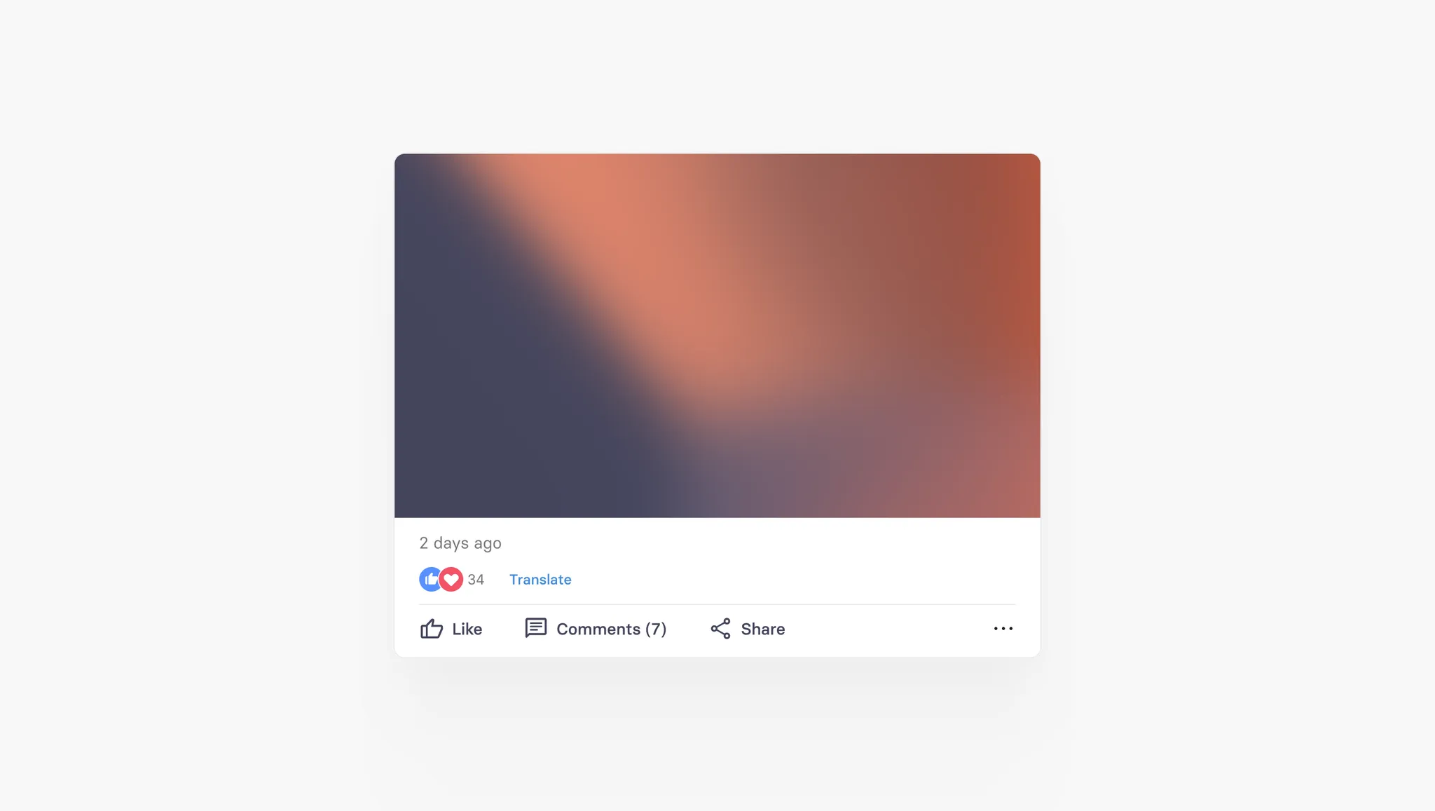

Image card specification
Field | Limit | Field type | App UI condition | Comment |
|---|---|---|---|---|
Source | Max. 160 characters | Optional | Shown in one line with '...' | |
Headline | Max. 360 characters | Optional | Shows full text | |
Image/GiF | Max. 700 MB | Mandatory | Shows full image | |
Copyright text | Max. 160 characters | Optional | Shown in one line with '...' over the image | Only appears if image is added |
Copyright type | 1. Copy right unknown (default) 2. Creative Commons 3. Licensed 4. Sublicensed | Copy right unknown (default) | Not visible in app | Only appears if image is added |
Caption | Max. 360 characters | Optional | Shows full text | Only appears if image is added |
Sub heading | Max. 360 characters | Optional | Shows full text | |
Text | Max. 20000 characters | Optional | 1. Shows upto 4 lines with 'Read more' option if there is NO subheading 2. If there is sub heading - than text field will not be shown in the main feed. User can ONLY read Text field content by clicking 'Read more' option | Formatting options available: - Bold - Underline - Italic - Hyperlink |
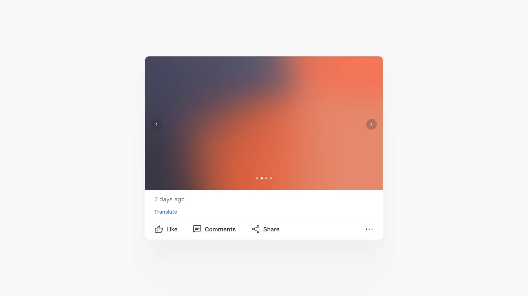
Gallery card
Gallery card is another native tchop short form post. It is extended version of image card which supports multiple images (up-to 20 images) with captions for each image in a single card along with other fields and formatting options from the text card. The only field required to create a gallery card is to create more than 1 image.
Gallery card specification
Field | Limit | Field type | App UI condition | Comment |
|---|---|---|---|---|
Source | Max. 160 characters | Optional | Shown in one line with '...' | |
Headline | Max. 360 characters | Optional | Shows full text | |
Images/GiFs (multiple) | Max. 700 MB (for single image) | 2 images are Mandatory - rest are optional | We show the first image in the feed and user can access rest of the image in full image preview screen | User can add 2-20 images in a gallery |
Copyright text (multiple) | Max. 160 characters | Optional | Shown in one line with '...' over the image | 1. Each image has it's own copyright text 2. Only appears if image is added |
Copyright type (multiple) | 1. Copy right unknown (default) 2. Creative Commons 3. Licensed 4. Sublicensed | Copy right unknown (default) | Not visible in app | 1. Each image has it's own copyright type 2. Only appears if image is added |
Captions (multiple) | Max. 360 characters | Optional | Shows full text | 1. Each image has it's own Caption 2. Only appears if image is added |
Sub heading | Max. 360 characters | Optional | 1. Shows full text in main feed 2. Not shown in the detailed view of card | |
Text | Max. 20000 characters | Optional | 1. Shows upto 4 lines with 'Read more' option if there is NO subheading 2. If there is sub heading - than text field will not be shown in the main feed. User can ONLY read Text field content by clicking 'Read more' option | Formatting options available: - Bold - Underline - Italic - Hyperlink |
Video card
Video card is also a tchop short form post with Video file attached to a card along with Video teaser image and caption in addition to other fields and formatting options from the text card. The only field required to create a video card is the video file.
Video card specification
Field | Limit | Field type | App UI condition | Comment |
|---|---|---|---|---|
Source | Max. 160 characters | Optional | Shown in one line with '...' | |
Headline | Max. 360 characters | Optional | Shows full text | |
Video | Max. 700 MB | Mandatory | Shows video with teaser image with Play icon | |
Teaser image | Max. 700 MB | Mandatory | Shows full image as teaser to the main video | |
Copyright text | Max. 160 characters | Optional | Shown in one line with '...' over the image | Only appears if new teaser image is added |
Copyright type | 1. Copy right unknown (default) 2. Creative Commons 3. Licensed 4. Sublicensed | Copy right unknown (default) | Not visible in app | Only appears if new teaser image is added |
Caption | Max. 360 characters | Optional | Shows full text | Only appears if Video is added |
Sub heading | Max. 360 characters | Optional | 1. Shows full text in main feed 2. Not shown in the detailed view of card | |
Text | Max. 20000 characters | Optional | 1. Shows upto 4 lines with 'Read more' option if there is NO subheading 2. If there is sub heading - than text field will not be shown in the main feed. User can ONLY read Text field content by clicking 'Read more' option | Formatting options available: - Bold - Underline - Italic - Hyperlink |
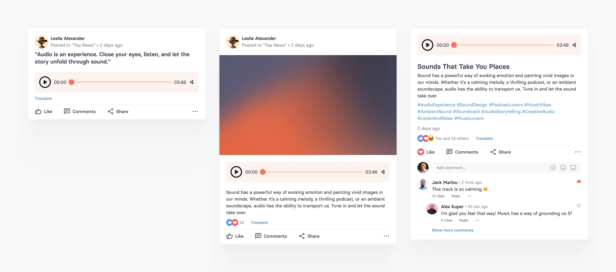
Audio card
Audio card is also a native tchop short form post with Audio file attached to a card along with Audio teaser image and caption in addition to other fields and formatting options from the text card. The only field required to create an audio card is the audio file.
Audio card specification
Field | Limit | Field type | App UI condition | Comment |
|---|---|---|---|---|
Source | Max. 160 characters | Optional | Shown in one line with '...' | |
Headline | Max. 360 characters | Optional | Shows full text | |
Audio | Max. 700 MB | Mandatory | Shows Audio player | |
Teaser image/Gif | Max. 700 MB | Optional | Shows full image | |
Copyright text | Max. 160 characters | Optional | Shown in one line with '...' over the image | Only appears if teaser image is added |
Copyright type | 1. Copy right unknown (default) 2. Creative Commons 3. Licensed 4. Sublicensed | Copy right unknown (default) | Not visible in app | Only appears if teaser image is added |
Caption | Max. 360 characters | Optional | Shows full text | Only appears if Audio is added |
Sub heading | Max. 360 characters | Optional | 1. Shows full text in main feed 2. Not shown in the detailed view of card | |
Text | Max. 20000 characters | Optional | 1. Shows upto 4 lines with 'Read more' option if there is NO subheading 2. If there is sub heading - than text field will not be shown in the main feed. User can ONLY read Text field content by clicking 'Read more' option | Formatting options available: - Bold - Underline - Italic - Hyperlink |
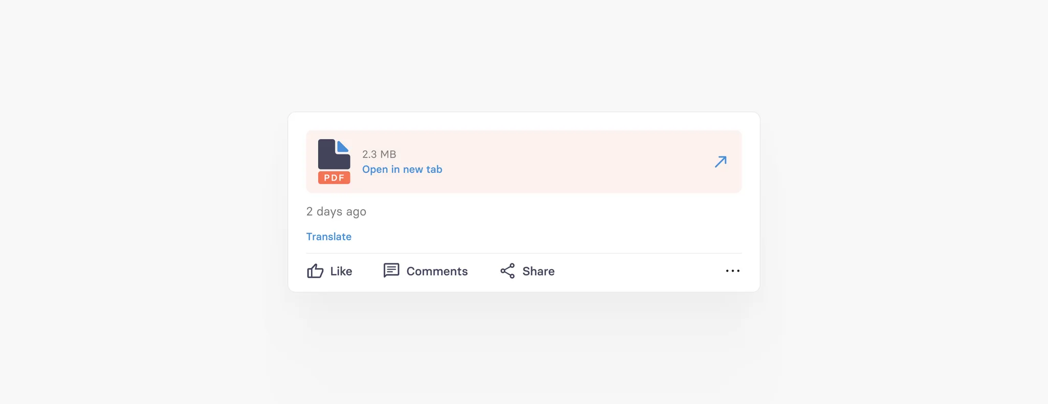
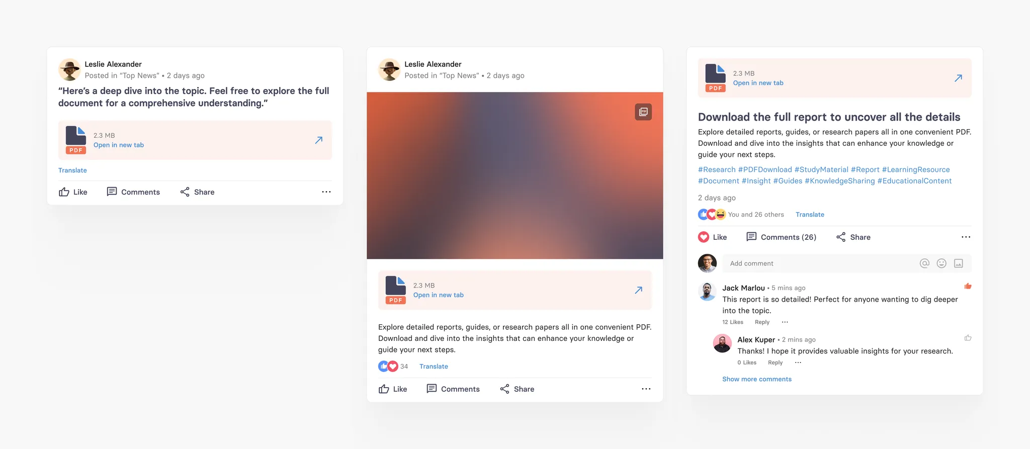
PDF card
PDF card is also a native tchop short form post with PDF file attached to a card along with PDF teaser image and caption in addition to other fields and formatting options from the text card. The only field required to create a pdf card is the pdf file, that can easily be upload.
It’s important to know that we automatically render a title image (the first page of the PDF) for the card’s teaser, but editor can simply replace and change this teaser image.
PDF card specification
Field | Limit | Field type | App UI condition | Comment |
|---|---|---|---|---|
Source | Max. 160 characters | Optional | Shown in one line with '...' | |
Headline | Max. 360 characters | Optional | Shows full text | |
PDF file | Max. 700 MB | Mandatory | Shows Pdf file as a link | |
Teaser image/Gif | Max. 700 MB | Mandatory | Shows full image | |
Copyright text | Max. 160 characters | Optional | Shown in one line with '...' over the image | Only appears if teaser image is added |
Copyright type | 1. Copy right unknown (default) 2. Creative Commons 3. Licensed 4. Sublicensed | Copy right unknown (default) | Not visible in app | Only appears if teaser image is added |
Caption | Max. 360 characters | Optional | Shows full text | Only appears if PDF file is added |
Sub heading | Max. 360 characters | Optional | 1. Shows full text in main feed 2. Not shown in the detailed view of card | |
Text | Max. 20000 characters | Optional | 1. Shows upto 4 lines with 'Read more' option if there is NO subheading 2. If there is sub heading - than text field will not be shown in the main feed. User can ONLY read Text field content by clicking 'Read more' option | Formatting options available: - Bold - Underline - Italic - Hyperlink |
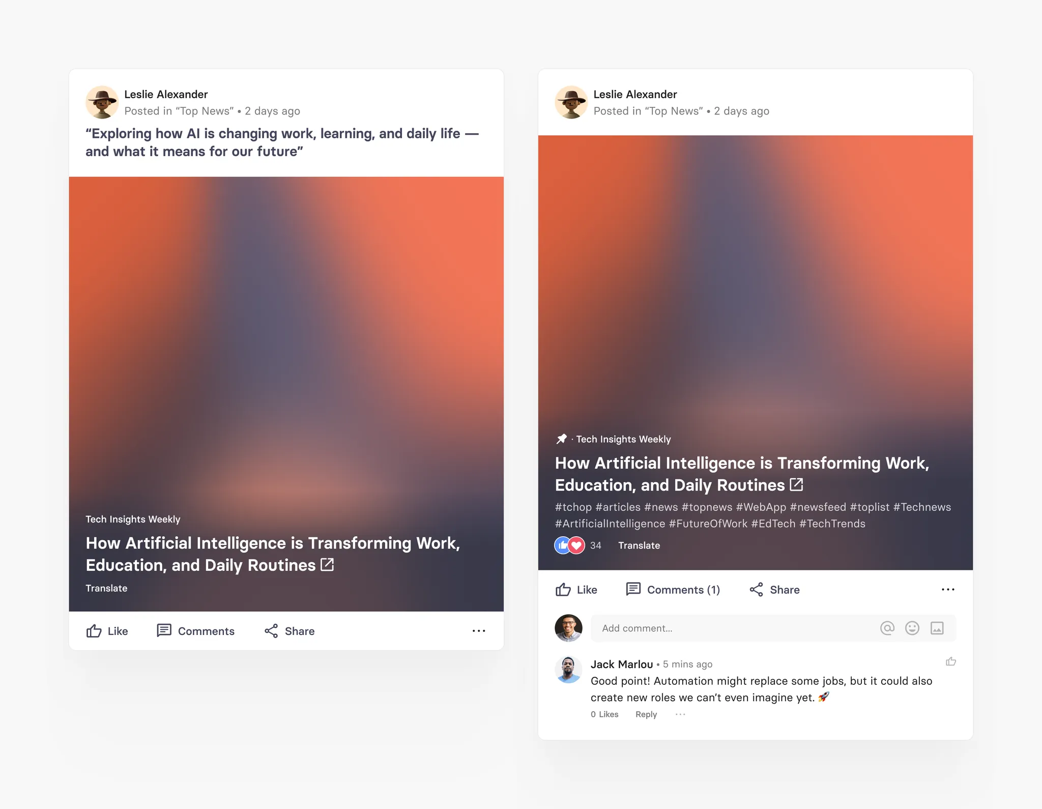
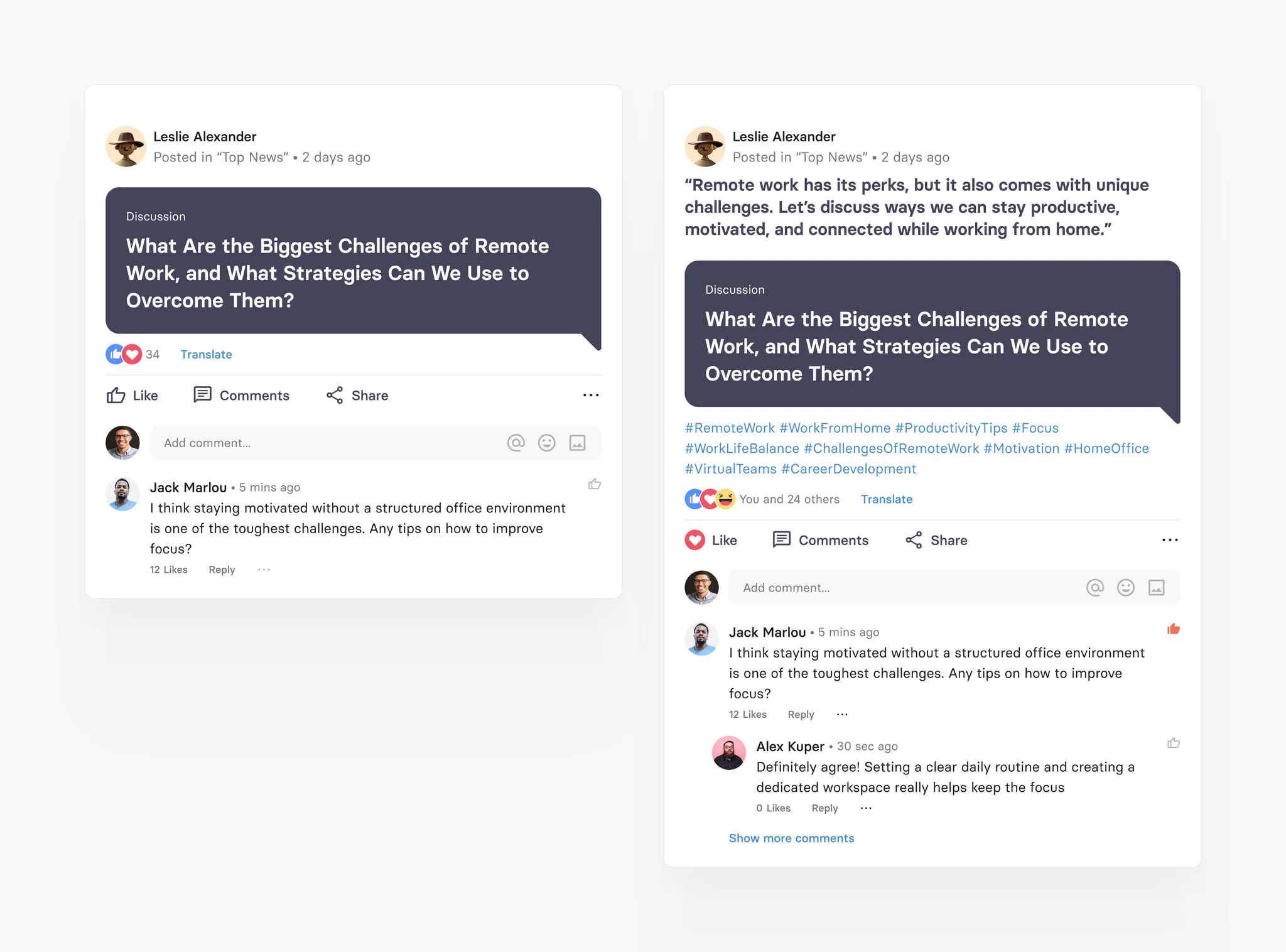
Thread card
Thread card is a special tchop native card which triggers comment screen on clicking on it. It work like a thread in a forum and can be used for all kinds of purposed. It’s perfect to ask questions or kick off discussions within the community or team. You can post an initial message as a Thread and then continue as a series of comments or replies.

Thread card specification
Field | Limit | Field type | App UI condition | Comment |
|---|---|---|---|---|
Headline | Max. 360 characters | Mandatory | Shows full text |
Long post card
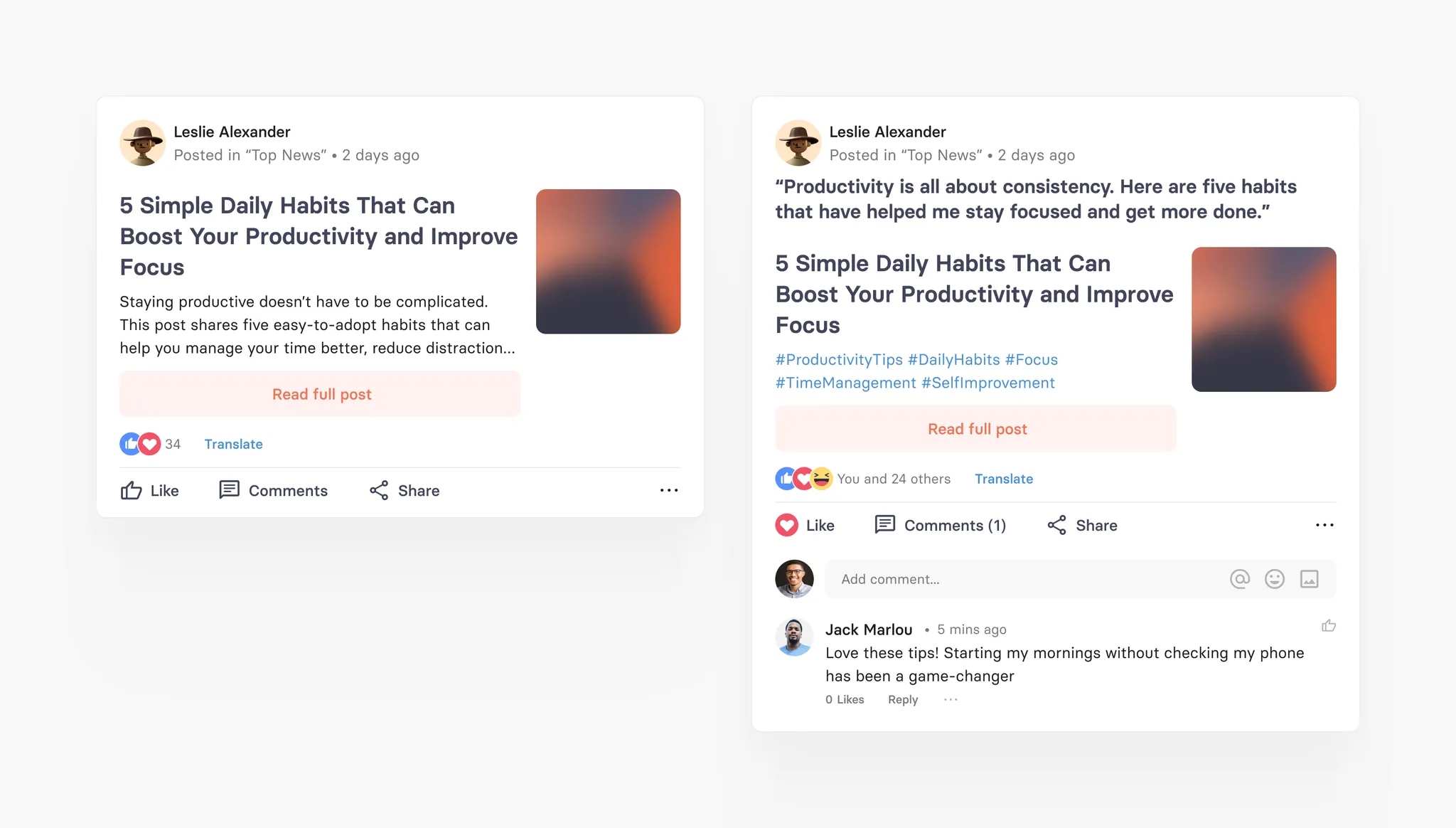
Long post cards are longform, full native post with teaser and rich formatting inside the text. They are basically what editorial teams can use to natively embed full articles. It’s body can hold all kinds of media from images to image galleries, from embedded links to quotes. There are different blocks (see below) that you can add to create a long post card. The content of the long post cards opens in a native view unlike Article cards which opens in Web view.
The only field that this card always requires is the headline. Plus: to create a stunning mix of cards, you can customise the teaser for this card type with an image, multiple teaser types and text fields. Nothing looks more boring than an endless list of the same looking teasers.
Similar to Article cards, long post card with images therefore can have four different teaser types. But of course this card can also just use headline and source - without an image.
Standard Default Type
Big Image Teaser
Small Image Teaser
No Image
Supported blocks in Long Post
Blocks | Blocks variation | Formatting option available |
|---|---|---|
Heading | - H1 - H2 - H3 - H4 - H5 - H6 | - Bold |
Paragraph | Text block | - Bold |
List | - Numbered list (support nesting) - Bullet list (support nesting) | - Bold |
Checkbox | Check list (doesn’t support nesting) | - Bold |
Delimiter | Line Break symbol | |
Image Gallery | - Can add up-to 10 images in a single Image Gallery block - Each image has it’s own caption field with no formatting | |
Embed Link | - Link (Article link, Twitter, Facebook, Instagram, Google Maps or any web URL): Show show preview of the embed link | |
Quote | - Alignment options: Left or center - Separate Author field available | |
Call out | Block for highlighting specific text or breaking it out from the rest of a document | - Bold |
Table | Ability to add table with multiple rows and columns You can also define if the table has heading row or not. | - Bold |
Code block | Define text as a code block | |
Audio | Ability to embed any audio file with the following format: .mp3,.wav,.aiff | |
Video | Ability to embed any Video file with any format | |
File | Ability to embed any file with the following format: .doc,.docx,.xls,.xlsx,.ppt,.pptx,.txt,.rtf,.odt,.ods,.odp | |
Ability to embed any PDF file with format .pdf | ||
Card block | Ability to embed any published card | |
Mix block | Ability to embed any published Mix | |
User block | Ability to embed any user profile |
Long post teaser specification
Field | Limit | Field type | App UI condition | Comment |
|---|---|---|---|---|
Comment | Max. 360 characters | Optional | Shown full text | |
Source | Max. 160 characters | Optional | Shown in one line with '...' | |
Title | Max. 160 characters | Mandatory | Shown full text | |
Abstract | Max. 700 characters | Optional | Shown full text | |
Image/Gifs | Max. 700 MB | Optional | Shows full image in different variants depending on teaser style | |
Copyright text | Max. 160 characters | Optional | Shown in one line with '...' over the image | Only appears if image is added |
Copyright type | 1. Copy right unknown (default) 2. Creative Commons 3. Licensed 4. Sublicensed | Copy right unknown (default) | Not visible in app | Only appears if image is added |
Teaser style | 1. Standard (default) 2. Small w/ intro 3. Small w/o intro 4. Big w/o intro | Standard (default) | Image is shown differently based on teaser style format | Only appears if image is added |
Author field | Max. 60 characters | Optional | Shown in one line with '...' |
Poll card
The Poll card allows users and editors to create interactive surveys directly inside your tchop app — similar to what you know from WhatsApp or X (formerly Twitter). With just a few taps, you can collect opinions, run quick votes, and spark engagement right in the feed.
Polls are one of the easiest ways to activate your community. They lower the barrier to participation and make interaction effortless.
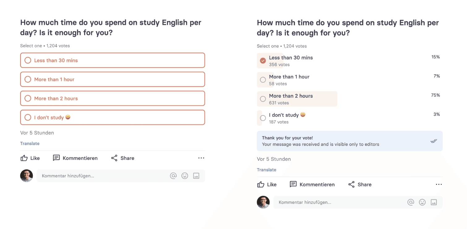
How the poll card works
A Poll card can be created directly inside a mix, just like any other content card. Users can vote with one tap and results update dynamically. You have full control over how much you want to reveal.
Polls can be — like all other cards — published in the main news feed, reposted, pinned to the top, linked inside other cards, or promoted via push notifications.
Editing restrictions
Once a poll card is published, its content and settings cannot be edited. Editing is only possible when both of the following conditions are met:
The card is unpublished, AND
The poll has received zero votes.
If the card is published OR has received at least 1 vote, all fields and options become disabled or hidden — with the exception of the Show results and Hide vote count settings, which can be changed at any time.
Poll card specification
Field | Limit | Field type | App UI condition | Comment |
|---|---|---|---|---|
Title | Max. 360 characters | Mandatory | Shown full text | Required field to create a poll card |
Image / Gallery / Video | Image & video: max. 700 MB. Gallery: up to 20 images. | Optional | Shows image, gallery or video in the card depending on type selected | Only one media type can be selected at a time |
Description | Max. 700 characters | Optional | Shown full text; no formatting allowed (plain text only) | Cannot contain rich text formatting |
Poll options | Min. 2, max. 12 options. Each option: max. 100 characters. | Mandatory (min. 2) | Each option shown as a tappable answer choice. | All options must be unique; no duplicate values allowed. No line breaks or formatting per option. |
Answer selection mode
When creating a poll, the editor must choose one of the following answer selection modes. The selected mode is visible on the card so voters know upfront how many options they can choose:
Single Answer: users can select only one option. Displayed as radio buttons in the UI.
Multiple Answers: users can select more than one option. Displayed as checkboxes in the UI.
Results & visibility settings
Poll editors can configure how results are presented to voters. These settings can be changed at any time, even after the card is published or has received votes:
Show results (default: off): when enabled, voters see the poll results immediately after voting. When disabled, voters see a “Thank you for your vote — results will be shown later” message. Results are only shown on the card when this option is enabled. You can enable or disable this setting at any time after card creation.
Show vote count (sub-option of Show results): when disabled, only the percentage per option is displayed — the total number of votes is hidden. This is useful when you want to show trend direction without revealing absolute participation numbers. Vote count is only shown on the card when this option is enabled. You can change this setting at any time after card creation.
Vote expiration
Set a date and time after which no further votes are accepted. The expiration time is visible on the card. Once expired, the poll is shown as closed. Results may still be visible after the expiry time depending on your Show results setting.


